ONYX - 9.0 - Utilisation - Interface de ONYX Designer/en
Différence entre versions
| (14 révisions intermédiaires par le même utilisateur non affichées) | |||
| Ligne 8 : | Ligne 8 : | ||
Window activation is explained in [[#menu-fichier|''<span class="underline">3.2.a File menu</span>'']]. | Window activation is explained in [[#menu-fichier|''<span class="underline">3.2.a File menu</span>'']]. | ||
| − | [[File: | + | [[File:OX_D_7.PNG]] |
The following image shows an overview of the Designer user interface. In this example, the ''Spooled File View'', ''Properties'', ''Conditions'' and ''Object Tree'' windows are activated. | The following image shows an overview of the Designer user interface. In this example, the ''Spooled File View'', ''Properties'', ''Conditions'' and ''Object Tree'' windows are activated. | ||
| Ligne 31 : | Ligne 31 : | ||
The display positions of each view can be configured according to the user preferences and habits. To do so, hold the button of your mouse down when clicking on the title of the View, then drag the mouse to the required display area or on an already positioned view, a display space with several views is now shown. | The display positions of each view can be configured according to the user preferences and habits. To do so, hold the button of your mouse down when clicking on the title of the View, then drag the mouse to the required display area or on an already positioned view, a display space with several views is now shown. | ||
| − | [[File: | + | [[File:OX_D_8.PNG]] |
==Menus and associated toolbars== | ==Menus and associated toolbars== | ||
| Ligne 39 : | Ligne 39 : | ||
===File Menu=== | ===File Menu=== | ||
| − | [[File: | + | [[File:OX_D_9.PNG]] |
'''New:''' | '''New:''' | ||
| Ligne 100 : | Ligne 100 : | ||
The Home menu gives access to the general options of the project or document being created: | The Home menu gives access to the general options of the project or document being created: | ||
| − | [[File: | + | [[File:OX_D_10.PNG]] |
'''Clipboard:''' | '''Clipboard:''' | ||
| Ligne 133 : | Ligne 133 : | ||
The ''Edit'' menu gives access to designing options of the current project or document: | The ''Edit'' menu gives access to designing options of the current project or document: | ||
| − | [[File: | + | [[File:OX_D_11.PNG]] |
In addition to the ''Clipboard'' and ''Font system'' sections, the following tools are also available in this menu: | In addition to the ''Clipboard'' and ''Font system'' sections, the following tools are also available in this menu: | ||
| Ligne 149 : | Ligne 149 : | ||
The ''Display'' menu gives access to display options of the different views of the application: | The ''Display'' menu gives access to display options of the different views of the application: | ||
| − | [[File: | + | [[File:OX_D_12.PNG]] |
'''Show/Hide:''' | '''Show/Hide:''' | ||
| Ligne 181 : | Ligne 181 : | ||
====Shape Menu of the Overlay (or Static)==== | ====Shape Menu of the Overlay (or Static)==== | ||
| − | [[File: | + | [[File:OX_D_13.PNG]] |
In addition to the ''Clipboard'' and ''Font system'' sections, the following tools are also available in this menu: | In addition to the ''Clipboard'' and ''Font system'' sections, the following tools are also available in this menu: | ||
| Ligne 201 : | Ligne 201 : | ||
'''Generate:''' | '''Generate:''' | ||
| − | *This option is specific to components | + | *This option is specific to components and is used to generate them. |
====Shape Menu of the Dynamic view==== | ====Shape Menu of the Dynamic view==== | ||
| − | [[File: | + | [[File:OX_D_14.PNG]] |
In addition to the ''Clipboard'' and ''Font system'' sections, the following tools are also available in this menu: | In addition to the ''Clipboard'' and ''Font system'' sections, the following tools are also available in this menu: | ||
| Ligne 231 : | Ligne 231 : | ||
The title bar of the application features a shortcut bar, or toolbar, called "Quick access'': | The title bar of the application features a shortcut bar, or toolbar, called "Quick access'': | ||
| − | [[File: | + | [[File:OX_D_15.PNG]] |
The tools and features accessible in this zone are <span class="underline">completely configurable</span> according to user habits. | The tools and features accessible in this zone are <span class="underline">completely configurable</span> according to user habits. | ||
| Ligne 237 : | Ligne 237 : | ||
To add a feature in the Quick access zone, you need to find the feature using the menus and then, right click and select "Add to the Quick access toolbar" as shown below: | To add a feature in the Quick access zone, you need to find the feature using the menus and then, right click and select "Add to the Quick access toolbar" as shown below: | ||
| − | [[File: | + | [[File:OX_D_16.PNG]] |
The new feature is then displayed in the title bar: | The new feature is then displayed in the title bar: | ||
| − | [[File: | + | [[File:OX_D_17.PNG]] |
To delete a feature from the Quick access zone, right-click on it and select ''Delete from the Quick Access toolbar''. | To delete a feature from the Quick access zone, right-click on it and select ''Delete from the Quick Access toolbar''. | ||
| Ligne 247 : | Ligne 247 : | ||
The drop down menu on the right of this zone allows you to customize the features accessible as well as how they are arranged, using the ''Customize the Quick access toolbar'' section (display order, add separators): | The drop down menu on the right of this zone allows you to customize the features accessible as well as how they are arranged, using the ''Customize the Quick access toolbar'' section (display order, add separators): | ||
| − | [[File: | + | [[File:OX_D_18.PNG]] |
Version actuelle datée du 29 août 2019 à 11:10
Sommaire
Interface of the application
General presentation
When using Designer for the first time, only the overlay designing view is displayed. This simple display mode allows you to only activate the windows you need.
Window activation is explained in 3.2.a File menu.
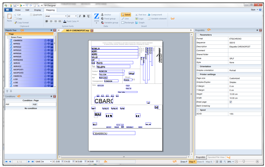
The following image shows an overview of the Designer user interface. In this example, the Spooled File View, Properties, Conditions and Object Tree windows are activated.
It is divided in several parts:
- 1: File Menu
- 2: Tabs in the Ribbon
- 3: Groups of tools associated with each tab of the Ribbon
- 4: Status bar with the tools used to position and size objects
- 5: Navigation between the static and the variable parts of a project + display zoom tools
The Designing Space where templates are designed is found between the menus and tools displayed at the top of the window and the status bar located at the bottom.
This design space can also be made up of several views, in addition to the central Designing view:
- 6: Properties View: of the format, of an object selected in the template
- 7: Spooled file View: included in the same display space as the Properties, multiple tabs are now available.
- 8: Object Tree View list of all the objects in the template (static and variable parts)
- 9: Conditions View: of the format, of a selected object.
The display positions of each view can be configured according to the user preferences and habits. To do so, hold the button of your mouse down when clicking on the title of the View, then drag the mouse to the required display area or on an already positioned view, a display space with several views is now shown.
Menus and associated toolbars
This part introduces you to the different menus and options available within them, in the Designer interface. Each notion will be further detailed in the following parts.
File Menu
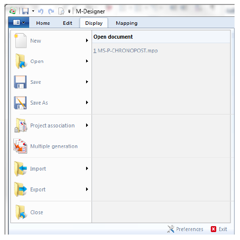
New:
- Project: creates a new project with default properties (DEFAULT format, sequence 00010, in A4, simplex).
- Component: creates a new component with default properties (A4, simplex).
- Variable element: creates a new variable element with default properties (A4 simplex).
- Document: creates a new Overlay document (.mpw) or Dynamic document (.mpi) according to the selected view (Draw F or Map F). This overwrites the current document.
Open:
- Project: opens an existing project by browsing file paths. The folder selected by default depends on the Server preferences of the application.
- Component: opens an existing component.
- Variable Element: opens an existing variable element.
- Document: opens an existing Overlay (.mpw) or a Dynamic document (.mpi), according to the selected view (Draw F or Map F). This overwrites the current document.
- Spooled File: used to select a spooled file to load in the application as a designing data template.
Save:
- Project: saves the curent project. Source files of the project will be saved, N-1 versions may also be saved according to user preferences.
- Document: saves the current Overlay (.mpw) or Dynamic document (.mpi), according to the view displayed (Draw F or Map F).
Save as:
- Project: saves the current project under an other name. Source files of the project will be saved under the new names given by the user.
- Document: saves the current document (.mpw or .mpi) under an other name.
Project association:
- Links several projects to make their generation easier. A project association creates a settings file on the disk, with a *.mpa extension, in which the projects concerned and the generation options are listed.
Multiple generation:
- Selects multiple Designer projects to generate them all at once.
Import:
- Designer file: imports another existing Designer overlay such as a component, or the static part of another project, in the static part of the current project.
- XML Designer: imports an entire Designer project in the application, after it was exported to XML. This imports the XML file as a new project, retrieving all its properties and designs.
- Resources: imports an external resource as overlay of a new project, in the application. Resources can either be XPS documents or AFPDS overlays.
Export:
- Printer (PCL5): prints the overlay of the current project on a printer registered on the workstation.
- Project: selects one or several projects to export in an archive (.zip) with the potential associated spooled files.
- XML Designer: exports the entirety of the current project in an XML description file. All properties and designs of the project are found in the resulting file which will then be imported in an other instance of the application, on an other workstation for instance.
Close:
- Closes the current project or document and detects unsaved changes.
Preferences:
- See 2.1 General.
Home Menu
The Home menu gives access to the general options of the project or document being created:
Clipboard:
- Cut/ copy/ paste one or several elements selected in the project (standard keyboard shortcuts Ctrl+X, Ctrl+C and Ctrl+V are also available)
- Copy the formatting of an element onto others (texts or shapes)
- Duplicate a selected element and set the required number of horizontal and vertical occurrences (this is useful when creating sheets of labels for instance).
System fonts:
- Text standard formatting: choose the TTF system fonts available on the workstation (Windows), the size, colour, bold/ underlined/ italic, justified or aligned.
Generate:
- Generate the project being created. This option is only available for projects being created (opened in the application).
- Generate an existing project association.
- Export overlay (see the File Menu part).
- Access the script utility in the Designer application.
Preview:
- Preview project currently being created.
- Select and load a spooled file in the application (this is useful when designing a document and previewing it).
- Multiple preview for multi sequence projects.
- Save an image of the preview.
- Load an XPS file as a layer (not included in the generation but displayed in the design as a pre-printed form).
- Unlink the source file (spooled file) to the template and close it.
- Carry out processings on XML input file using scripts.
Edit Menu
The Edit menu gives access to designing options of the current project or document:
In addition to the Clipboard and Font system sections, the following tools are also available in this menu:
Sort:
- Applied to one or several selected elements, sorting can bring them to the front or to back, manage alignments and rotations. These options can also be accessed by right clicking on the selected elements and further detail will be given in the following parts of this documentation.
Position according to grid:
- To help with designing, a grid can be displayed to make positioning elements easier for the user. The two options of this section help to adjust the spacing of the grid (size of the grid and thus the precision of element positioning) and snap objects to the grid while they are moved.
Display Menu
The Display menu gives access to display options of the different views of the application:
Show/Hide:
Given that none of these options are activated when opening the software for the first time, the functions which are most suitable for the basic use of Designer will be marked with the term (recommended).
- Grid: displays the grid in the designing view.
- Top/Left Ruler: displays the top and left hand rulers of the designing view. It is possible to place guides in these rulers in order to align objects more easily. A Left click on the ruler places and collapses a rule-guide. A Right click on an existing rule-guide deletes it.
- Spooled file view: displays the loading view of the example spooled file (or XML file) (recommended).
- Properties : displays the properties view of the project and elements (recommended).
- Conditions: displays the conditions view (recommended whenever the design work deals with a dynamic part).
- Object Tree: displays the list of all the elements positioned in the document template, some features related to the elements can also be accessed.
- Tab bar: displays the tab navigation bar for the different projects opened in the application.
Characters list:
- Lists all the characters supported by the application according to a code page and font. This can be useful to insert special characters, which cannot be directly typed in, in a document.
Refresh:
- Refreshes the screen.
Windows:
This helps you manage the many windows of your projects opened in the application. It allows you to activate, save or close some of them or all of them all at once.
Shape Menu
This menu features all the drawing and composition tools for your document template. This menu is arranged differently depending on the part of the project concerned, the overlay part (static) or the dynamic part (variable).
Shape Menu of the Overlay (or Static)
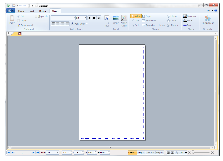
In addition to the Clipboard and Font system sections, the following tools are also available in this menu:
Insert:
- Add and position a zone which contains static text. This text can then be formatted using the associated formatting options.
- Add and position a static image (such as a company logo).
- Add, parameter and position a static table by defining the number of rows, columns, the outline and their formatting, as well as the title of each row / column, …
Shapes:
- Standard drawing palette to add lines, curves, squares, rectangles, rounded rectangles, circles, ellipses, as well as some preset shapes.
Styles:
- Formatting options related to each of the previous elements: style and colour of the outline, filling style and colour, line thickness.
Generate:
- This option is specific to components and is used to generate them.
Shape Menu of the Dynamic view
In addition to the Clipboard and Font system sections, the following tools are also available in this menu:
Data:
These tools are used to process source file data (spooled file). There are two types of tools:
Group:
- Adds, parameters and positions groups of data: fixed and variable groups.
- Also adds anchors used to position variable groups.
Zone:
- Adds, parameters and positions data recovery zones.
Insert:
- Inserts other dynamic elements, in addition to the data from the spooled file: straight lines, rectangles, text zones input using the keyboard, dynamic images, graphs...
- Adds components and/or variable elements which were designed elsewhere in the project.
"Quick access" toolbar
The title bar of the application features a shortcut bar, or toolbar, called "Quick access:
The tools and features accessible in this zone are completely configurable according to user habits.
To add a feature in the Quick access zone, you need to find the feature using the menus and then, right click and select "Add to the Quick access toolbar" as shown below:
The new feature is then displayed in the title bar:
To delete a feature from the Quick access zone, right-click on it and select Delete from the Quick Access toolbar.
The drop down menu on the right of this zone allows you to customize the features accessible as well as how they are arranged, using the Customize the Quick access toolbar section (display order, add separators):


