ONYX - 9.0 - Utilisation - Fonctionnement des graphiques/en
Différence entre versions
(Page créée avec « Font and style<br/> The font and style of the axes are defined in the chart properties and not in the chart type boxes. Even if you don't set a label in the chart propert... ») |
(Page créée avec « The XML method is riskier because the number of lines present in the XML fields preceding the camembert was unknown, so it would have to join a lot more graph, or do more... ») |
||
| (72 révisions intermédiaires par le même utilisateur non affichées) | |||
| Ligne 148 : | Ligne 148 : | ||
The font and style of the axes are defined in the chart properties and not in the chart type boxes. Even if you don't set a label in the chart properties, you must set the font to use. | The font and style of the axes are defined in the chart properties and not in the chart type boxes. Even if you don't set a label in the chart properties, you must set the font to use. | ||
| − | |||
| − | + | ==Axis titles== | |
| − | |||
| − | |||
| − | |||
| − | |||
| − | |||
| − | |||
| − | + | To give a title to the axes, you can either: | |
| − | + | #- Create a <b>Graphic</b> / <b>Title of the X axis</b> (or Y) type zone retrieving the title in the spool | |
| + | #- Set title in chart | ||
| − | |||
| − | + | To set the axis title in the chart: | |
| − | #- | + | #- In the chart properties, select the Positioning tab |
| − | #- | + | #- Double-click on the <b>X axis title</b> area |
| + | #- Enter a value in the label | ||
| − | |||
| − | |||
| − | |||
| − | |||
| − | + | Font and style<br/> | |
| − | + | The font and style of the axes are defined in the chart properties and not in the chart type boxes. Even if you don't set a label in the chart properties, you must set the font to use. | |
| − | |||
| − | + | ==Chart title== | |
| − | |||
| − | |||
| − | |||
| − | |||
| − | |||
| − | |||
| − | + | To give a title to the graph, you can either: | |
| − | + | #- Create a zone of type <b>Graph</b> / <b>Title of the graph</b> retrieving the title in the spool | |
| + | #- Set title in chart | ||
| − | |||
| − | + | To set the axis title in the chart: | |
| + | #- In the chart properties, select the Positioning tab | ||
| + | #- Double-click on the <b>Graphic Title</b> area | ||
| + | #- Enter a value in the label | ||
| − | |||
| − | + | Font and style<br/> | |
| + | The font and style of the axes are defined in the chart properties and not in the chart type boxes. Even if you don't set a label in the chart properties, you must set the font to use. | ||
| − | |||
| − | == | + | ==Minimum / maximum values== |
| − | |||
| − | + | To set the min and max values for the Y axis, you can either: | |
| + | #- Create a zone of type <b>Graphic</b> / <b>Maximum (minimum) value of the Y axis</b> retrieving the value in the spool | ||
| + | #- Set this value in chart properties | ||
| − | |||
| − | |||
| − | + | To set the min and max values in the chart properties: | |
| + | #- In the chart properties, select the <b>Positioning</b> tab | ||
| + | #- Double-click on the image representing the graph | ||
| + | #- In the <b>Y Axis</b> tab, modify the values | ||
| − | + | Font and style<br/> | |
| − | + | The font and style of the axes are defined in the chart properties and not in the chart type boxes. Even if you don't set a label in the chart properties, you must set the font to use. | |
| − | |||
| − | + | =Parameters= | |
| − | |||
| − | + | ==Round to the nearest n in the Y axis== | |
| − | |||
| − | + | This type of zone allows you to round the values of the vertical axis (for histograms and lines). | |
| − | |||
| − | + | ==X axis data== | |
| − | |||
| − | + | This type of zone retrieves values from the spool to use as horizontal axis data (for histograms and lines). | |
| − | == | + | ==Y axis data== |
| − | |||
| − | |||
| − | + | This type of zone retrieves values from the spool to use as vertical axis data (for histograms and lines). | |
| − | |||
| − | |||
| − | = | + | ==Legend data== |
| − | + | This type of zone retrieves from the spool the values which will be used to draw the legend.<br/> | |
| + | This is the caption text. | ||
| + | |||
| + | |||
| + | ==Chart data== | ||
| + | |||
| + | |||
| + | This type of zone retrieves from the spool the values which will be used to draw the graph.<br/> | ||
| + | It only retrieves signed digital data. Other characters are ignored. | ||
| + | |||
| + | |||
| + | ==Number of Y axis intervals== | ||
| + | |||
| + | |||
| + | This type of zone retrieves values from the spool to use as the number of vertical axis intervals (for histograms and lines). | ||
| + | |||
| + | ==X axis origin== | ||
| + | |||
| + | |||
| + | This type of zone retrieves a value from the spool as the origin of the vertical axis (for histograms and lines) i.e. as the first value of the axis. | ||
| + | |||
| + | |||
| + | ==X-axis title== | ||
| + | |||
| + | |||
| + | This zone type retrieves a value from the spool as the title of the horizontal axis (for histograms and lines). | ||
| + | |||
| + | |||
| + | ==Y-axis title== | ||
| + | |||
| + | |||
| + | This zone type retrieves a value from the spool as the title of the vertical axis (for histograms and lines). | ||
| + | |||
| + | |||
| + | ==Chart title== | ||
| + | |||
| + | |||
| + | This zone type retrieves a value from the spool as the graph title. | ||
| + | |||
| + | ==Maximum value of Y-axis== | ||
| + | |||
| + | |||
| + | This zone type returns a value of the spool as the maximum value of the vertical axis (for histograms and lines).<br/> | ||
| + | Attention, if a chart data exceeds this value, it will not be displayed corre | ||
| + | |||
| + | |||
| + | ==Minimum value of Y-axis== | ||
| + | |||
| + | |||
| + | This zone type returns a value from the spool as the minimum value of the vertical axis (for histograms and lines).<br/> | ||
| + | Attention, if a chart data is less than this value, it will not be displayed correctly. | ||
| + | |||
| + | ==Barcodes== | ||
| + | |||
| + | To create a barcode in MapDraw, simply create an object of type “Graphics”. | ||
[[Fichier:Graph3.png|500px|vignette|néant]] | [[Fichier:Graph3.png|500px|vignette|néant]] | ||
| − | |||
| − | + | In the “Type” tab, the number of zones represents the number of types of values to represent, in most cases only one zone is required. The use of multiple zones allows you to define a particular color and style for each value of the chart. | |
| + | |||
| + | |||
| + | The “Attributes” tab allows you to define the appearance, color, fill type, etc. of each zone. | ||
| + | |||
| − | + | The “Positioning” tab allows you to position each element of the graph, including the graph itself, the title of each axis, the title of the graph as well as the legend. | |
[[Fichier:Graph4.png|500px|vignette|néant]] | [[Fichier:Graph4.png|500px|vignette|néant]] | ||
| − | |||
| − | <b> | + | By double-clicking on a particular element, the Properties window is accessed allowing you to modify the properties of the object (character police, color, etc.) |
| + | |||
| + | |||
| + | <b>Defining Chart Values</b> | ||
| + | |||
| + | |||
| + | To define the graph attributes and add values, graph type zones must be added. | ||
| + | |||
| + | |||
| + | The possible parameters are: | ||
| + | #- Graph Data | ||
| + | #- X-axis data | ||
| + | #- Y-axis data | ||
| + | #- Chart title | ||
| + | #- X-axis titer | ||
| + | #- Y-axis title | ||
| + | #- Legend data | ||
| + | #- Minimum value of Y-axis | ||
| + | #- Maximum Y-axis value | ||
| + | #- Number of Y-axis intervals | ||
| + | #- Rounding the Y-axis values to n | ||
| + | #- Y-axis origin | ||
| + | |||
| + | |||
| + | These zones allow you to retrieve information from the spool and use it in the graph. | ||
| − | |||
| − | + | <b>IMPORTANT:</b><br/> | |
| − | + | Graph type areas must have the same name as the graph they are linked to. | |
| − | |||
| − | |||
| − | |||
| − | |||
| − | |||
| − | |||
| − | |||
| − | |||
| − | |||
| − | |||
| − | |||
| − | |||
| − | + | =Overlaid histograms= | |
| − | |||
| − | |||
| − | + | To obtain this type of graph, it is necessary to superimpose several graphs: | |
[[Fichier:Graph5.png|500px|vignette|néant]] | [[Fichier:Graph5.png|500px|vignette|néant]] | ||
| − | + | ||
| + | It is enough to play on the spacing in percentages Left and Right: | ||
[[Fichier:Graph6.png|500px|vignette|néant]] | [[Fichier:Graph6.png|500px|vignette|néant]] | ||
| − | |||
| − | + | By default, a bar of a histogram takes up the entire available width (100%), but by modifying these parameters, it is possible to reduce the width of the bar as well as its position in it by providing a different scale to the left and right . | |
| + | |||
| + | |||
| + | It is then sufficient to overlay multiple graphs with different spacing settings to obtain the desired rendering: | ||
[[Fichier:Graph7.png|500px|vignette|néant]] | [[Fichier:Graph7.png|500px|vignette|néant]] | ||
| − | |||
| − | <b> | + | Here, four graphics are superimposed giving a 3D look. |
| + | |||
| + | <b>Example</b> | ||
[[Fichier:Graph8.png|500px|vignette|néant]] | [[Fichier:Graph8.png|500px|vignette|néant]] | ||
| Ligne 313 : | Ligne 360 : | ||
[[Fichier:Graph5.png|500px|vignette|néant]] | [[Fichier:Graph5.png|500px|vignette|néant]] | ||
| − | |||
| − | + | =Dynamic Graph Positioning= | |
| − | |||
| − | == | + | A graphic is considered as a fixed zone, so it is impossible to place it dynamically on the page based on the zones located before it. |
| + | |||
| + | Though, you can play around this rule thanks to some conditions. | ||
| + | |||
| + | |||
| + | ==With a PAG/TXT spool== | ||
[[Fichier:Graph11.png|500px|vignette|néant]] | [[Fichier:Graph11.png|500px|vignette|néant]] | ||
| Ligne 327 : | Ligne 377 : | ||
[[Fichier:Graph13.png|200px|vignette|néant]] | [[Fichier:Graph13.png|200px|vignette|néant]] | ||
| − | |||
| − | + | Here is a simple example of a paged spool containing data to be used in a camembert. Appearance conditions must be set so that the graph appears only if the lines are at certain values. | |
| + | |||
| + | |||
| + | Next you need to duplicate the graph. For example, 15 new graphs will be created with the same settings, but each offset 1cm downwards more than the previous one. <b>It is important to increase the conditions, otherwise the zone will only be based on the same lines</b>. | ||
[[Fichier:Graph14.png|200px|vignette|néant]] | [[Fichier:Graph14.png|200px|vignette|néant]] | ||
| Ligne 335 : | Ligne 387 : | ||
[[Fichier:Graph15.png|500px|vignette|néant]] | [[Fichier:Graph15.png|500px|vignette|néant]] | ||
| − | + | ||
| + | After duplication, we get this, each graph is scaled incrementally downwards and checks for different rows in the spool. | ||
[[Fichier:Graph16.png|200px|vignette|néant]] | [[Fichier:Graph16.png|200px|vignette|néant]] | ||
| − | + | First image: The data starts line 12. | |
| − | + | Second image: the data starts line 22. | |
[[Fichier:Graph17.png|200px|vignette|néant]] | [[Fichier:Graph17.png|200px|vignette|néant]] | ||
| Ligne 346 : | Ligne 399 : | ||
[[Fichier:Graph18.png|200px|vignette|néant]] | [[Fichier:Graph18.png|200px|vignette|néant]] | ||
| − | |||
| − | + | The graph has therefore changed position according to the position of its data in the spool. | |
| + | |||
| − | + | This is the only way to position a fixed pseudo-dynamic fashion zone, but a future evolution of ONYX should allow a simpler and more tailored solution to be provided. | |
| − | |||
| − | + | ==With an XML spool== | |
| + | |||
| + | |||
| + | The best way to render the position of a graph dynamically with an XML spool and to add a field in the input file containing the number of zones present before the graph, as we cannot rely on the number of rows or all other information comes from the spool because the graph is not part of it. | ||
| + | |||
| + | |||
| + | For example: The “BEFORECAM” field indicates which combination of zones are present before the camembert, for example, its value is 1. | ||
[[Fichier:Graph19.png|500px|vignette|néant]] | [[Fichier:Graph19.png|500px|vignette|néant]] | ||
| − | + | Here is the condition on the first graph: | |
[[Fichier:Graph20.png|200px|vignette|néant]] | [[Fichier:Graph20.png|200px|vignette|néant]] | ||
| Ligne 365 : | Ligne 423 : | ||
| − | |||
| − | + | The duplicate button can be used, but the value must be changed manually because this is not a row, so the increment will not change anything. | |
| + | |||
| + | |||
| + | The first graph showed that if the value is equal to 1, the second if it is 2, etc… | ||
| + | |||
| + | |||
| + | The problem with this solution, is that it requires a modification of the Connect potential that generates the XML file to reach the field, and assign a value to it based on the content of the previous fields. | ||
| − | |||
| − | + | The XML method is riskier because the number of lines present in the XML fields preceding the camembert was unknown, so it would have to join a lot more graph, or do more code-lettering to fit different functions of the blocks. | |
{{DEFAULTSORT:ONYX:9.0:Utilisation:Fonctionnement des graphiques}} | {{DEFAULTSORT:ONYX:9.0:Utilisation:Fonctionnement des graphiques}} | ||
Version actuelle datée du 2 janvier 2025 à 10:22
ONYX Designer includes a graphics creation module whose operation is explained below.
Sommaire
Create a new graphic
- - Click on the Graphic icon on the Variable toolbar.
- - Click on the page and drag the mouse to draw the frame where the graphic will be printed.
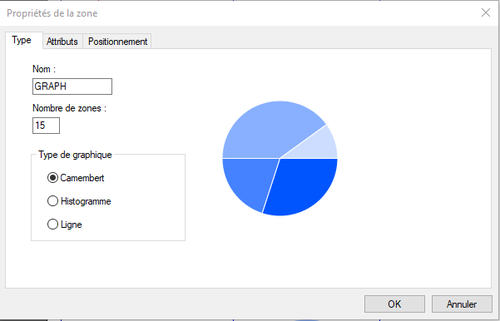
- - Enter a name, a number of zones, and check the type of chart you want to print.
The number of zones to enter is the maximum number of zones that your graph can contain.
Configure a chart
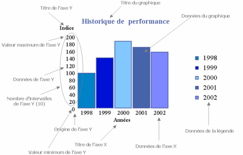
The graphics allow fairly advanced configuration. You can modify axis titles, number of intervals, maximum values…
For all these parameters, you can either set the values for this graph or retrieve this information from the spool. The information retrieved from the spool will take priority over the values defined “hard” for this graph.
This is useful, for example, in the case where the chart title is not present in all pages of the spool. This amounts to considering the values in the chart as default values. In this case, the graphic type zones must be conditioned on the presence of a value in the spool.
- - Chart title
- - Title of the axes
- - Axis data
- - Minimum / maximum values
- - Number of Y axis intervals
- - Y axis origin
- - Round Y axis values
Graphic type area
These areas allow you to completely configure your graph according to the spool values: titles, legend, axes, etc.
- - Chart data
- - X axis data
- - Y axis data
- - Chart title
- - X axis title
- - Y axis title
- - Legend data
- - Minimum value of Y axis
- - Maximum value of Y axis
- - Number of Y axis intervals
- - Round to the nearest n in the Y axis
- - Y axis origin
Retrieving data field
A chart does not retrieve data from the spool on its own. It uses graphic type areas. This allows you to completely condition data recovery.
To associate zones with a graph, simply give them the same name.
The zones can of course belong to a group, fixed or variable, be conditioned...
Font and style information is not used.
A Graphic type zone does not print anything on its own.
Retrieve data from the spool as chart data
- - Create your zone (positions in the original file, condition, group membership, etc.)
- - Name it as the complex graph it depends on
- - Select type Graphic
- - Choose subtype Chart Data
Configuration
Round Y axis values
To round the Y axis data values, you can either:
- - Create a zone of type Graphic / Round the Y axis to the nearest n recovering the value "n" in the spool
- - Set value in chart properties
To change the rounding pitch:
- - In the chart properties, select the Positioning tab
- - Double-click on the image representing the graph
- - In the Y Axis tab, change the value
Font and style
The font and style of the axes are defined in the chart properties and not in the chart type boxes. Even if you don't set a label in the chart properties, you must set the font to use.
Axis data
To define the axis data, you must create a Graphic / X axis data (or Y) zone retrieving the values in the spool.
Font and style
The font and style of the data are defined in the chart properties and not in the chart type boxes.
To change the font and style:
- - In the chart properties, select the Positioning tab
- - Double click on the chart image
- - Change the values of the Y Axis Font or X Axis Font tab
Number of Y axis intervals
To set the number of Y axis intervals, you can either:
- - Create a zone of type Graphic / Nbr of intervals of the Y axis recovering the value in the spool
- - Set this number in chart properties
To set the number of intervals in the chart properties:
- - In the chart properties, select the Positioning tab
- - Double-click on the image representing the graph
- - In the Y Axis tab, modify the value
Font and style
The font and style of the axes are defined in the chart properties and not in the chart type boxes. Even if you don't set a label in the chart properties, you must set the font to use.
Y axis origin
To set the origin of the Y axis, you can either:
- - Create a zone of type Graphic / Origin of the Y axis recovering the value in the spool
- - Set value in chart properties
To set the origin of the Y axis in the chart properties:
- - In the chart properties, select the Positioning tab
- - Double-click on the image representing the graph
- - In the Y Axis tab, modify the value
Font and style
The font and style of the axes are defined in the chart properties and not in the chart type boxes. Even if you don't set a label in the chart properties, you must set the font to use.
Axis titles
To give a title to the axes, you can either:
- - Create a Graphic / Title of the X axis (or Y) type zone retrieving the title in the spool
- - Set title in chart
To set the axis title in the chart:
- - In the chart properties, select the Positioning tab
- - Double-click on the X axis title area
- - Enter a value in the label
Font and style
The font and style of the axes are defined in the chart properties and not in the chart type boxes. Even if you don't set a label in the chart properties, you must set the font to use.
Chart title
To give a title to the graph, you can either:
- - Create a zone of type Graph / Title of the graph retrieving the title in the spool
- - Set title in chart
To set the axis title in the chart:
- - In the chart properties, select the Positioning tab
- - Double-click on the Graphic Title area
- - Enter a value in the label
Font and style
The font and style of the axes are defined in the chart properties and not in the chart type boxes. Even if you don't set a label in the chart properties, you must set the font to use.
Minimum / maximum values
To set the min and max values for the Y axis, you can either:
- - Create a zone of type Graphic / Maximum (minimum) value of the Y axis retrieving the value in the spool
- - Set this value in chart properties
To set the min and max values in the chart properties:
- - In the chart properties, select the Positioning tab
- - Double-click on the image representing the graph
- - In the Y Axis tab, modify the values
Font and style
The font and style of the axes are defined in the chart properties and not in the chart type boxes. Even if you don't set a label in the chart properties, you must set the font to use.
Parameters
Round to the nearest n in the Y axis
This type of zone allows you to round the values of the vertical axis (for histograms and lines).
X axis data
This type of zone retrieves values from the spool to use as horizontal axis data (for histograms and lines).
Y axis data
This type of zone retrieves values from the spool to use as vertical axis data (for histograms and lines).
Legend data
This type of zone retrieves from the spool the values which will be used to draw the legend.
This is the caption text.
Chart data
This type of zone retrieves from the spool the values which will be used to draw the graph.
It only retrieves signed digital data. Other characters are ignored.
Number of Y axis intervals
This type of zone retrieves values from the spool to use as the number of vertical axis intervals (for histograms and lines).
X axis origin
This type of zone retrieves a value from the spool as the origin of the vertical axis (for histograms and lines) i.e. as the first value of the axis.
X-axis title
This zone type retrieves a value from the spool as the title of the horizontal axis (for histograms and lines).
Y-axis title
This zone type retrieves a value from the spool as the title of the vertical axis (for histograms and lines).
Chart title
This zone type retrieves a value from the spool as the graph title.
Maximum value of Y-axis
This zone type returns a value of the spool as the maximum value of the vertical axis (for histograms and lines).
Attention, if a chart data exceeds this value, it will not be displayed corre
Minimum value of Y-axis
This zone type returns a value from the spool as the minimum value of the vertical axis (for histograms and lines).
Attention, if a chart data is less than this value, it will not be displayed correctly.
Barcodes
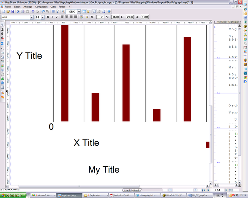
To create a barcode in MapDraw, simply create an object of type “Graphics”.
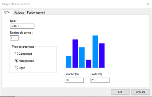
In the “Type” tab, the number of zones represents the number of types of values to represent, in most cases only one zone is required. The use of multiple zones allows you to define a particular color and style for each value of the chart.
The “Attributes” tab allows you to define the appearance, color, fill type, etc. of each zone.
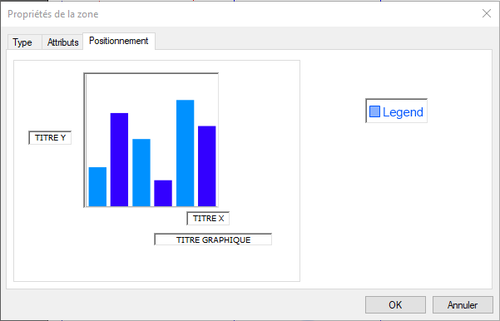
The “Positioning” tab allows you to position each element of the graph, including the graph itself, the title of each axis, the title of the graph as well as the legend.
By double-clicking on a particular element, the Properties window is accessed allowing you to modify the properties of the object (character police, color, etc.)
Defining Chart Values
To define the graph attributes and add values, graph type zones must be added.
The possible parameters are:
- - Graph Data
- - X-axis data
- - Y-axis data
- - Chart title
- - X-axis titer
- - Y-axis title
- - Legend data
- - Minimum value of Y-axis
- - Maximum Y-axis value
- - Number of Y-axis intervals
- - Rounding the Y-axis values to n
- - Y-axis origin
These zones allow you to retrieve information from the spool and use it in the graph.
IMPORTANT:
Graph type areas must have the same name as the graph they are linked to.
Overlaid histograms
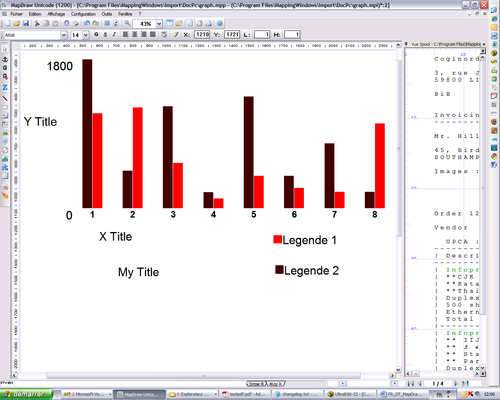
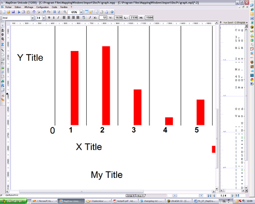
To obtain this type of graph, it is necessary to superimpose several graphs:
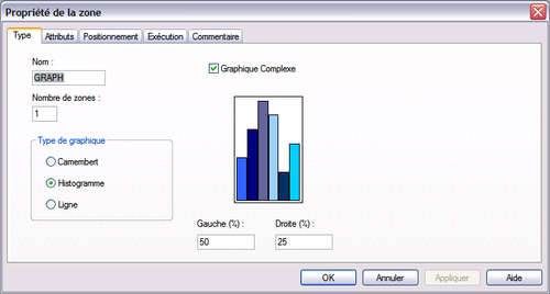
It is enough to play on the spacing in percentages Left and Right:
By default, a bar of a histogram takes up the entire available width (100%), but by modifying these parameters, it is possible to reduce the width of the bar as well as its position in it by providing a different scale to the left and right .
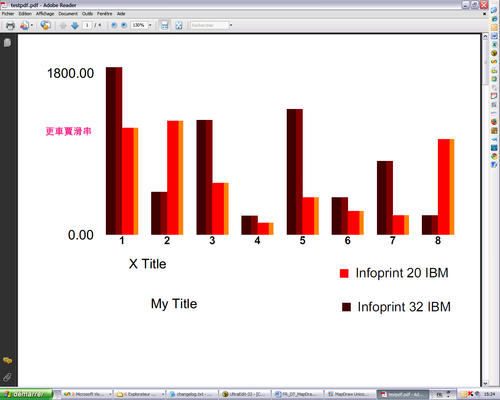
It is then sufficient to overlay multiple graphs with different spacing settings to obtain the desired rendering:
Here, four graphics are superimposed giving a 3D look.
Example
+
=
Dynamic Graph Positioning
A graphic is considered as a fixed zone, so it is impossible to place it dynamically on the page based on the zones located before it.
Though, you can play around this rule thanks to some conditions.
With a PAG/TXT spool
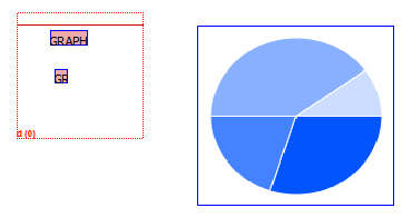
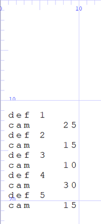
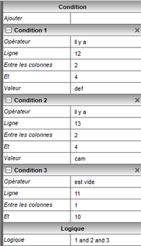
Here is a simple example of a paged spool containing data to be used in a camembert. Appearance conditions must be set so that the graph appears only if the lines are at certain values.
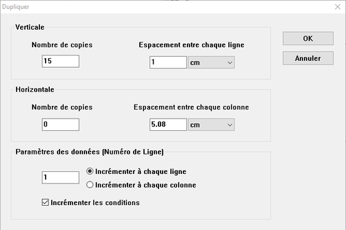
Next you need to duplicate the graph. For example, 15 new graphs will be created with the same settings, but each offset 1cm downwards more than the previous one. It is important to increase the conditions, otherwise the zone will only be based on the same lines.
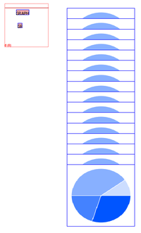
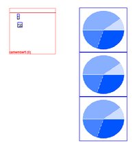
After duplication, we get this, each graph is scaled incrementally downwards and checks for different rows in the spool.
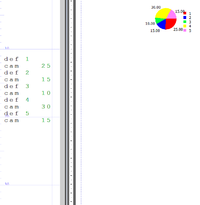
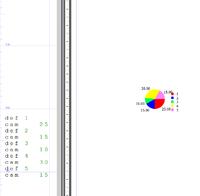
First image: The data starts line 12. Second image: the data starts line 22.
The graph has therefore changed position according to the position of its data in the spool.
This is the only way to position a fixed pseudo-dynamic fashion zone, but a future evolution of ONYX should allow a simpler and more tailored solution to be provided.
With an XML spool
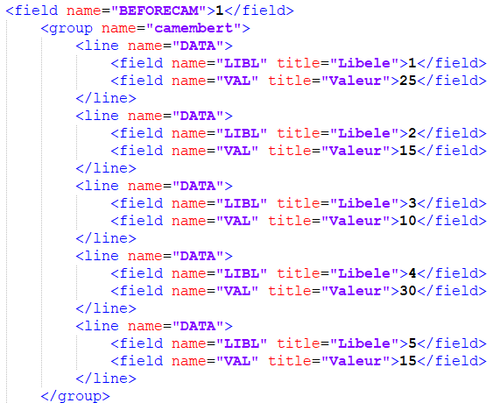
The best way to render the position of a graph dynamically with an XML spool and to add a field in the input file containing the number of zones present before the graph, as we cannot rely on the number of rows or all other information comes from the spool because the graph is not part of it.
For example: The “BEFORECAM” field indicates which combination of zones are present before the camembert, for example, its value is 1.
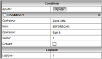
Here is the condition on the first graph:
The duplicate button can be used, but the value must be changed manually because this is not a row, so the increment will not change anything.
The first graph showed that if the value is equal to 1, the second if it is 2, etc…
The problem with this solution, is that it requires a modification of the Connect potential that generates the XML file to reach the field, and assign a value to it based on the content of the previous fields.
The XML method is riskier because the number of lines present in the XML fields preceding the camembert was unknown, so it would have to join a lot more graph, or do more code-lettering to fit different functions of the blocks.
